The Query Dashboard presents permission-based high-level and detailed information specific to the Queries for the study. Refer to Table 6: Description of Elements on the Query Dashboard, for additional information.
For details about features and functions that are available on multiple screens within this system, refer to the Navigation and Features, Common Dashboard Features and Navigation, and Glossary sections plus Table 2.
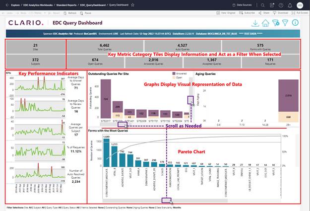
Figure 88: Query Dashboard
·
The Query
Dashboard aggregates data and information into visualizations. Many aspects (tiles, bar graphs, labels) of
the visualizations act as filters for selecting specific metrics and updating
the visualizations (excluding KPIs) to represent the data for the selections.
·
Multiple
options are available that allow you to View, Filter, Download, and Drill Down
to additional details about the category metrics that display on this screen.
·
Use the ![]() (open
filter) button at the top of the screen to set and select the metrics that
display on your dashboard screen.
(open
filter) button at the top of the screen to set and select the metrics that
display on your dashboard screen.
·
Click on a
Tile, Bar (in chart), or Label (below Bar chart) to filter by selected
metrics. Hold the Ctrl key (keyboard) to
select multiple filters. All tiles and
charts update to represent data for your selection (n/a for KPI graphs).
·
Hover over
a tile to display onscreen information with a definition for the metric
category.
·
Links
display for selected metrics when you hover to display additional onscreen
detail.
·
Use the ![]() (clear
filter) button to remove all filters and reset the onscreen display of
data.
(clear
filter) button to remove all filters and reset the onscreen display of
data.
·
The KPI
trend graphs are NOT filters and therefore not affected by
filter selections.
The table below provides details about the elements on the Query Dashboard.
|
Option |
Description |
|
Sites (tile) |
The numeral in this tile indicates the number of Sites with Queries. |
|
Subjects (tile) |
The numeral in this tile indicates the number of Subjects with Queries. |
|
Category Metric Tiles |
These tiles display the category name and number of queries. |
|
Key Performance Indicators (KPIs) |
These tiles display KPI data visualizations on the left side of the screen. Date labels display at the bottom of the KPIs tile. Refer to KPIs for details. |
|
Bar Charts |
The bar charts display data for selected Metric Categories (default = all categories selected/aggregated data displays. Use the options to isolate and display data for selected metrics. Refer to Bar Charts for details. |
|
Pareto Chart |
A Pareto Chart contains both bars and a line graph. Individual values display as bars (descending order/most to least, with the cumulative total represented by the line. The form name displays below each bar. Click an element in a Pareto chart (bar, line, identifier) to navigate to an enhanced view of the data. Use the menu options to drill in to detail for one (1) or more categories in the chart. Refer to Forms with the Most Queries (Pareto Chart) for details. |
|
Query List Grid |
A grid displays (at Pareto chart location) when any Data filter option is used to isolate data. |
Table 6: Description of Elements on the Query Dashboard